Monday, April 26, 2010

Sunday, April 18, 2010

Monday, April 12, 2010

Monday, April 5, 2010

Monday, March 29, 2010

Monday, March 1, 2010

Sunday, February 28, 2010

pipes
This is almost like a maze but one that is easy to get in and out of. Still alot like the screen saver.
Vignelli
This reminds me of the pipe screen savers.
it also has the same effect on me as the screen saver it carries my eyes a cross the screen.

Maps


Rhode Island 195 Transport
Great example of information design. This is also easy on the eye well constructed. I normally hate maps because they are so hard to navigate but not the design of these. This is really meant for people that are visiting.
1916 Edward Johnston
London Transport
The design of this is well constructed. It looks more like a design than a map of a London Transport. everything here is easy to read and easy on the eye.

Ripley's


By Anil Adyanthaya
This is like a little modern example of what Ripley did when he first started.
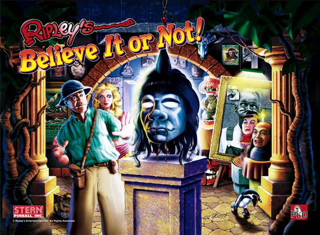
Design by Stern PInball
This is a design for a pinball machine. This reminds me alot more of what i am use to seeing.
The article is right about how the typeface is very noticable. It did not take me a second to know what this design was for.

By Ripley 1939
I never new this was a real artist. I thought it was just a TV show. I remember myself always running home to catch the show. His style of art is very unusiual.

Wednesday, February 17, 2010

Saturday, February 6, 2010

Reading on signs

As we can see when symbolizes such as man and woman are so strong we will always be able to use it as another universal language.
money
REMIXED
restroom in china
This is a little funny. In many ways will have to say with no question asked any one will still say that this is a sign for the ladies rest room. I think that kn ow matter what this icon will always be associated with the rest room.
man/woman
Its crazy how i never really look at these symbol and wonder how are where it came about. It also brings to meaning how we as humans are so programed to where we always respond to images and associate them with out ever thinking about what we are responding to.

Wednesday, February 3, 2010

Tuesday, January 26, 2010

Reading on comics

BY: Dave Devries 1995
As todays comic seems to be a lot more realistic
it seems that it will never get away from using icon to grap its readers. Also the rage in her face does it job take away from the needs of work. letting the image speak for its self.

By: Mary Fleener
Life of the party
Iconic comic can go really far as Mary uses
iconic style of art in her work such as cubeism.What stands out is that she brings her words to life only with selective ones placing them in bold letters.Everything in this image seems to draw you right around the image. Even the words seem to make up the image.

By: Marvel
Comics

Like what Scott McCloud talked about with how many comics and how they mix cartoon and realistic drawings together to get their point across. This image kinds of shouts out here is the new face super hero. An iconic image of spider man in the back ground taking pictures of The president in the fore front. At the same time we also see another iconc image the camera that Peter Parker uses.

Contemporary Icon inspiration


Monday, January 25, 2010

Children typography

By: Julia cinald I love the curves they are almost like those in Alice and wonderland. The flat background pushes everything forward.
By: lewis carroll
This is what i would have to say set provide
the way for lots of books with typography for children.
even though it will not be accepted for what they are
children books.
BY: Sharon Werner and Sarah Fore
This images brings me to the 1950s to the 80s where progressive artists felt that the picture should be the story. But these two artist took the typeface did what artist from the early time frame did not approve and proved them wrong the letters made this image. I love it.

Wednesday, January 20, 2010


In order for me to get from typeface and image to icons after hours of researching images from the 1920s-1930s.
I had to use about 7 to 10 different letters to create each icons.
in some cases a lot of the same cuts that I have made I was able to reuse.
For the most part I was influenced a lot by the shapes and images that where printed on
electronic of the 1920s-1930s, along with the perimeter of houses. In the end result I combine the shapes and design of other products of the time period to create my icons.

Sunday, January 17, 2010

READING ON PEACE SYMBOL


Hope
by David llan
This remains me of the peace symbols. It really does not bring much feelings other than the strong will of the peace image. It really seems to drag to out the content of the peace image. it seems to not carry its own identity.
Raised Fist
This images shows power and a will. The lines along the fingers shows that the fist has a lot of tension build up. the bold black on a white back ground
helps everything to come forward.

Reading on Swastika logo


The Blood Drop

This bring about a feeling of anger. It can be linked right with the Swastika logo. I feel as if the red over powers the cross. almost as it is letting you know that nothing can stop its agenda.
Communism
This image is one that also bring to life the negative events that it is linked with such as the Swastika logo. The bright red as the back ground is what stands out the most and as a result makes me venture off into linking the images with its time in history.

Monday, January 11, 2010

Paper Bombs

Japanese Leaflets
This really draws me into the image it also shows
how the emotion of any soldier would really be beaten up.
This image from the reading was funny to me it
kind of showed me how paper bombs where used to play
down on people in war emotions and after they are stressed out
from a long stressed out war and really war and want to return home.

Surrender Leaflets

Photo by SPC Robert Risnear D Co

This image brings a sense of you have NO chance of winning
It is kind of sad because it shows peole getting bomb with out any fight back. Bullied
Death.. by Blix
This image shows how humor can
come in many different forms this image does not use red
but it does use a image that brings fear but also
have a confused look but in away make me question if i am on the right side.
By Blix
This image is really funny and it reminds
me of the red dog because it also has that
am bad look along with the heavy red. I think it
is very effective with the way how it show an over life size man joggling his opponent.

Simplicissimus
Thomas Heine
This dog brings an aggressive yet confused look
but the red color brings a sense of be aware. I think
its a great way to get peoples attention.

Thursday, January 7, 2010

Reading on Simplissimus poster/ early propaganda

In both readings I find how propaganda can be used on many different levels to express or carry out different communication. It also shows how propaganda in its many forms feeds off of peoples emotions. For instance in the article "Paper Bombs" that speaks about Leafleting that only seems to convey two kind of message to it readers live or die. It shows how images along with a few simple words, when targeted to the right audience can land a fetal blow. For example Leafleting where normally aimed at troops that where sick of the Cold War. It normally sent messages that told them that you are basically wasting you time and life with the war. In the article on simplissimus poster we see how propaganda also comes in the form of cartoon while having a little humor but in the end bring down the human emotion along with it.